UX Designer


Structuring the Story
UX Strategy + Information Architecture for Marketing Impact
The Challenge
Menlo’s case studies were hidden in a horizontal scroll buried on a blog page—hard to find, outdated, and difficult to use as marketing tools.
Key issues included:
-
Being mixed in with blog content on the “Stories” page
-
Lacking clear navigation or organization
-
Featuring outdated content and little focus on outcomes
-
Prensenting dense layouts with poor scannability
-
Not aligning with current business goals
Project Details
Timeline: 2 months
Role: UX strategist and designer
Team: Sole UX designer; collaborated closely with Delivery Lead/Project Manager, marketing and sales stakeholders, and company founders (CEO and COO)
Client: Menlo Innovations (internal project)
Deliverables: Heuristic evaluation, competitive analysis report, content audit, wireframes, prototypes, annotated design documentation.
Project Context: Internal initiative to improve the marketing impact of case studies by making them more discoverable, relevant, and persuasive while maintaining brand consistency
Objective
Transform Menlo's case studies into a client-friendly, outcomes-focused resource that aligns with brand standards and supports business development.
-
Create a dedicated, user-friendly case studies landing page
-
Improve case study discoverability and relevance through clear labeling and organization
-
Highlight success metrics to increase marketing credibility
-
Maintain consistency with Menlo’s design system and branding
My Role
-
Led research, strategy, and design from end-to-end
-
Conducted heuristic evaluations and competitive analyses to identify pain points and best practices
-
Audited existing content, focusing on reducing text density and emphasizing outcomes
-
Collaborated closely with the delivery lead and marketing stakeholders to align on goals and feedback
-
Designed wireframes and interactive prototypes, iterating based on internal feedback
-
Prepared detailed design documentation for web development handoff
Case Studies Landing Page: Before vs After
Menlo's original case studies were buried in a "Stories" page, difficult to find and navigate. The redesigned page establishes a clear, filterable landing space aligned with business development goals.
Before: "Stories" Page
-
Case studies on page with blog posts and newsletters
-
Horizontal scroll made it hard to browse content
-
Outdated layout lacked structure or visual clarity.
Before: "Stories" Page

The original "Stories" page combined multiple content types and required users to horizontally scroll through individual case studies.
After: Dedicated Case Studies Page
-
Case studies separated into a standalone, filterable page
-
Vertical layout for faster browsing and scanning
-
Clear headings, modern design, and improved usability

The redesigned landing page supports prospect discovery through filterning, clean layout, and a strong visual hierarchy aligned with brand identity.
Information Architecture Comparison
To improve discoverability and clarity, I restructured the site's information architecture to separate case studies from blog content and stramline user access.
Original IA

Updated Information Architecture

Simplified IA enables clear user paths and content discovery by separating case studies from blogs and newsletters.
Approach

Heurisic Evaluation

Stakeholder Interviews

Content Audit

Wireframes

Prototypes

Feedback Rounds
Case Studies Landing Page Redesign
Original "Stories" Page

New "Case Studies" Page

Updated design separates blog and newsletter from case studies and adds filterable cards for easier navigation.
Individual Case Study Redesign
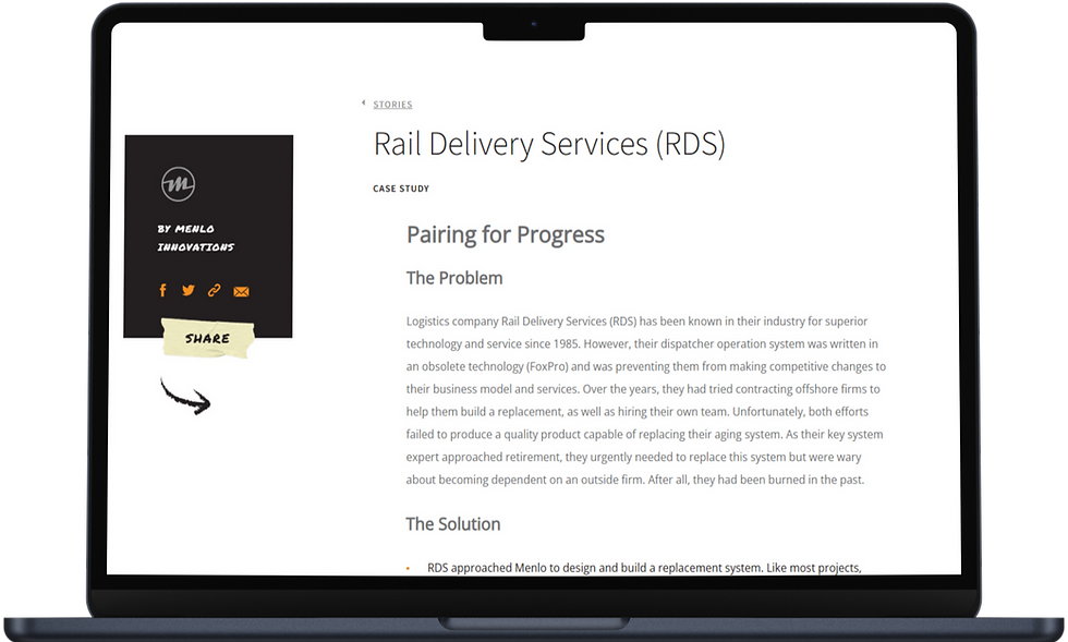
Original Individual Case Study Page

New Individual Case Study Page

Redesigned layout introduces visual interest, clearer sections, and stakeholder validation.
Key Findings
-
Case studies were hard to find and poorly organized, limiting their marketing utility
-
Visitors struggled to connect case study content with their own challenges due to vague labeling
-
Text-heavy layouts without clear success metrics weakened persuasive power
-
Brand design system constraints required careful balance between consistency and clarity
-
Highlighting outcomes in a concise narrative increased stakeholder and client engagement
Focus on the problem. This should make them want to call us."
COO, Menlo Innovations
Individual Case Study Page: Before vs After
To complement the redesigned landing page, I also restructured the layout of individual case study pages. The original pages lacked visual appeal, scannable content, and stakeholder quotations. My redesign introduces a more engaging top-of-page experience, clear content hierarchy, and a stronger focus on outcomes and stakeholder validation, all while aligning with Menlo's brand guidelines.
Before: Individual Case Study Page

Before: "Stories" Page
Dense blocks of text with minimal structure or visual interest. Success metrics and stakeholder quotes were buried or nonexistant, limiting the page's marketing potential.

After: Individual Case Study Page
Introduces strong visual elements, modular content blocks, and branded design elements. Highlights outcomes and includes curated stakeholder quotes to increase credibility and engagement.
The Challenge
Give space researchers an elegant and intuitive way to manage and reduce the dimensionality of their data so they can better analyze and interpret phenomena in space.

Wireframes
To explore layout options for the new individual case study pages, I developed three distinct wireframe concepts. Each emphasized different content priorities, from detailed storytelling to visual hierarchy and performance metrics. I shared these early-stage designs with stakeholders to gather feedback on content organization, visual flow, and alignment with business goals.
Final Designs
Wireframe A: Text Heavy

Wireframe B: Visual-first

Wireframe C: Metrics-Focused

Wireframes tested layout preferences; feedback indicated a preference for shorter copy, increased visuals, and stakeholder feedback, which informed the final version.
Information Architecture Comparison
To improve discoverability and clarity, I restructured the site's information architecture to separate case studies from blog content and streamline user access.
Original Information Architecture

Updated Information Architecture

Simplified IA enables clear user paths and content discovery by separating case studies from blogs and newsletter.
Final Design
Final Top of Page

The redesigned top section grabs attention with strong visual hierarchy, clearer navigation, and persuasive elements aligned with brand style.
Key Improvements:
-
Catchy headline and image preview communicate the case study's focus at a glance.
-
Stakeholder quote adds social proof early.
-
Branded color accents draw attention without overwhelming.
-
New left-hand filter improves discoverability.
Final Mid-content

This section balances clarity and marketing impact with outcome-focused content and scannable formatting.
Key Improvements:
-
New "The Solution" section highlights key project outcomes.
-
"The Results" section, now in a branded teal color block emphasizes outcomes.
-
Bulleted lists improve readability for time-limited users.
Final Bottom

Closing elements deepen engagement with multimedia and stakeholder credibility.
Key Improvements:
-
Embedded video section provides richer storytelling.
-
Scrollable carousel of stakeholder quotes builds trust.
-
Balanced layout maintains visual rhythm and alignment.
This is funky. It's a very Menlo thing. We like to be playful."
Sales Lead, Menlo Innovations
Outcomes
Although not yet implemented, the design was approved and is queued for development once budget is available.
-
Implementation-ready: Final designs and documentation delivered, ready for dev
-
Leadership alignment: CEO, COO, and marketing team aligned around new direction
-
Marketing impact potential: New layout better supports storytelling and client outreach
-
Design system adherence: Adheres to brand standards for seamless integration
-
Strategic foundation: Set a new model for future internal and marketing content

Insights
-
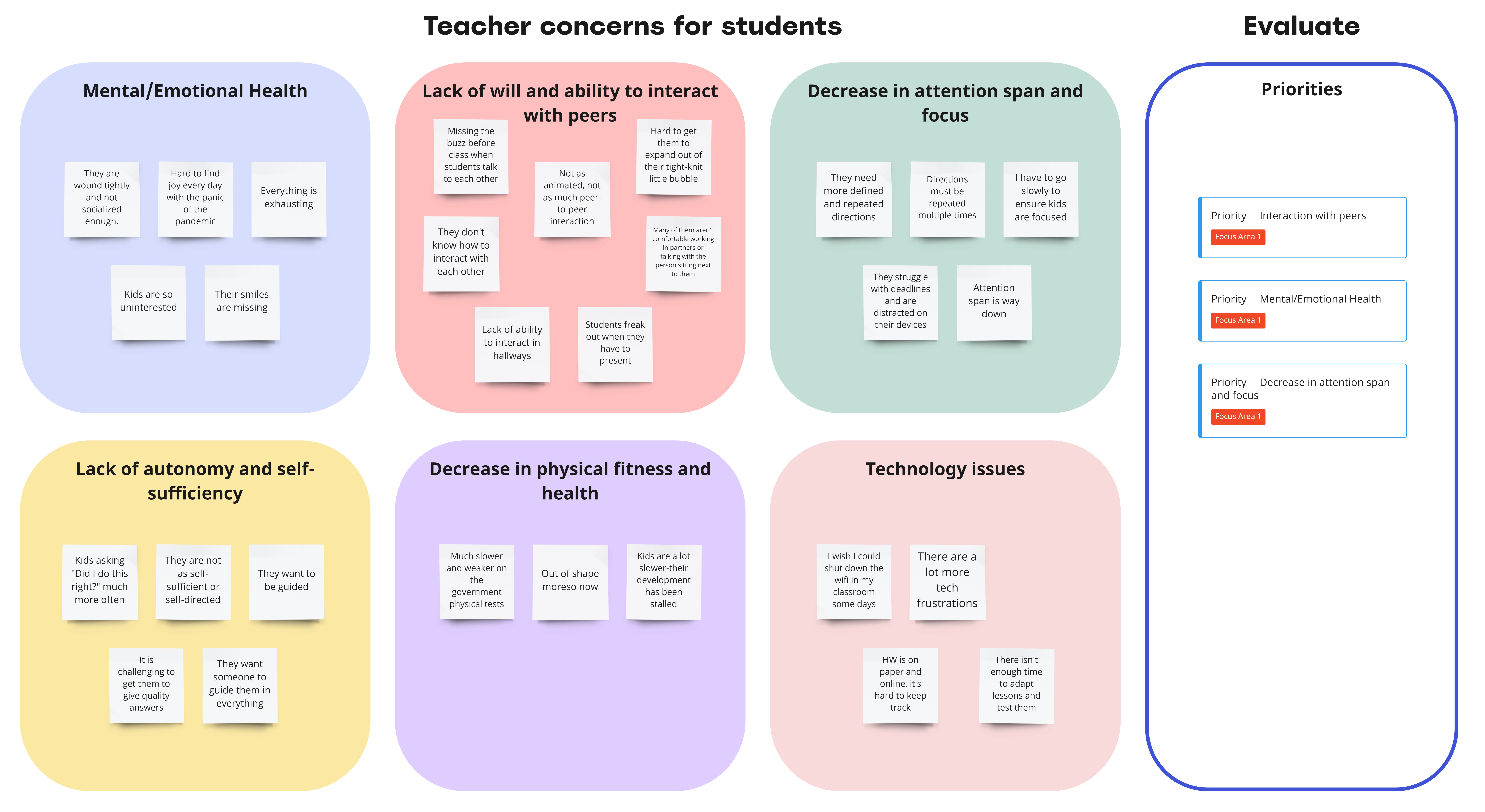
The affinity map based on our interviews led to six key themes and four priority insights we wanted to address.
-
How Might We questions narrowed the focus of our solution.
Affinity Map

One
Essential Dimensions:
Scientists needed to visualize data across critical dimensions including time, energy, flux, look direction of the space instrument, and pitch angle. Additional dimensions would emerge once the spacecraft launched.
Two
Analytical Control:
They needed the flexibility to reduce the dataset by averaging over specific variables or slicing individual dimensions to explore patterns.
Three
Visual Flexibility:
Traditional 2D plots were not enough. Users needed to manipulate the data space more fluidly--beyond x/y plots.
Key Insights
Goal Statement
Our EdTech learning platform will let students practice academic content while encouraging interpersonal communication which will improve academic performance and interpersonal skills and engage students in the school environment.
Filling the gap
There were so many stellar academic products on the market already, so we realized that the best way to solve our problem was to create a layer of interpersonal activities that integrates with the online academic practice tools teachers already use to help students communicate and have fun with each other.

Iteration and Refinement
Client Feedback:
In collaboration working sessions, we discovered the original design needed more granularity and flexibility. Based on stakeholder input, we:
-
Introduced a table view for selecting individual Look Directions (80 total) and averaging subsets
-
Replaced a static slider with a grouped view (10s) to make navigating high-volume datasets scalable
-
Ensured the component design would remain usable as more data dimensions became available
Wireframes
I created this rough wireframe and a lo-fi prototype to explore our concept through the teacher user flow.
For our initial mockups, we chose a calming blue theme for our design. These mockups follow the lo-fi wireframes closely.
Initial mockups
_edited.jpg)

Final Homepage Mockup
To simplify the usability, I condensed all of the main actions to the header.

COMING UP: Usability Testing and Refinement
We finalized our designs three weeks after addressing this core dimensionality reduction feature. Next, we planned usability testing with additional scientists beyond the core stakeholder group.
Key Feature: Reducing Dimensionality
Dimensionality Visualization: Joanie effortlessly manages dimensions like time, energy, flux, look direction, pitch angle, and mass.
Adjusting Dimensions: Joanie can average dimensions, select individual slices of dimensions to analyze, or average subsets of data, in addition to choosing which dimensions to put on the x-, y-, and z-axes.
Intuitive Interface: Our design supports both novice and expert users, minimizing the need for coding.

Outcome
The feature we developed for reducing dimensionality will greatly benefit the IMAP mission. Scientists like Joanie will be able to conduct advanced data analysis more efficiently and accurately. Our iterative, user-driven approach ensures the tool will meet all requirements and be ready for the 2025 launch.
Results
-
Improved clarity: Scientists reported a more intuitive experience compared to their self-built tools
-
Expanded flexibility: Enabled workflows not previously possible in their own tools
-
Validated concept: Design finalized and queued for implementation ahead of live mission data
Lessons Learned
-
Meaningful UX improvements can be made within strict brand and design constraints
-
Close collaboration with marketing and project leadership is critical for aligning priorities
-
Competitive analysis provides valuable insights and benchmarks for design decisions
-
Emphasizing measurable impact in content boosts credibility and user engagement
-
Iterative feedback loops ensure solutions meet diverse stakeholder needs
